
Predicting COVID-19 Deaths in the US: What We Know and What We Don't
/Things could be worse than expected.

One of the more macabre aspects of the coronavirus epidemic are the variety of studies predicting how many individuals will die of the disease. Macabre, yes, but necessary as no other metric holds as much power to drive societal interventions.

Indeed, in the past week, we’ve seen open discussion about how many deaths may be “acceptable” in terms of an implicit economic tradeoff.
Individuals are comparing covid-19 deaths to those caused by automobile accidents, seasonal flu, and even “deaths of despair”, with some suggesting that our current economic woes should carry at least some weight when we decide how best to reduce the number of deaths.
This is wonderfully British.
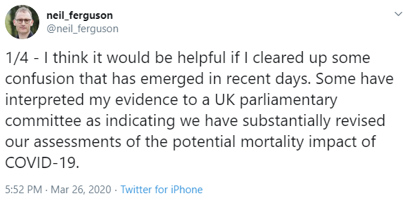
But where do those predictions come from? Last week, Dr. Deborah Birx, response coordinator for the White House Coronavirus Task Force, noted that the Imperial College group in the UK had revised their death estimates for that country from 500,000 to 20,000. Now, this wasn’t precisely true, the old estimates were based on a policy of no mitigation, and the new on a policy of strict social distancing – as the lead author clarified.
But still – a range from 20,000 to 500,000 deaths leaves a lot of room for cherry picking, and cherry picking data is the last thing we need right now. So I wanted to take a look at the death prediction models, their assumptions, their uncertainties, to figure out what we really need to know.
OK some background. There are a LOT of ways to make predictions like this, many of which are incredibly complicated and use computing power not available to most of us.
But most of them still rely on the same basic structure, known as the S-E-I-R model.
S: The number of susceptible individuals in a population
E: The number exposed but not yet infectious
I: The number of infectious individuals
R: the number recovered, or, via death or vaccination “removed” from the susceptible population
Now, individuals can move from one state to another. The rate that they move from, say, susceptible to infectious depends on a bunch of viral and host factors, but those numbers model the epidemic for us, they allow us to make predictions.
But when we’re talking about death, we really only need to know two things.
1) How many people are going to get the disease?
And 2) what’s the true death rate?

The base equation is pretty simple. It’s just that we don’t know the value of any of the variables.
Number of infected * true death rate = number of deaths.
Of course, the devil is in the details. Let’s dive in.
We’ll start off easy – what is worst-case scenario? Let’s set the boundary condition.
We need to know the number of susceptibles. Let’s assume that all 327 million Americans are susceptible to this virus.
How many of them will get infected? The driving force here, is the R0 – the basic reproduction number. Remember, this is the average number of susceptible people the average infected person infects.
For COVID-19, most modelers have been using 2.5, appreciating that COVID-19 is substantially more infectious than seasonal flu, for example.
Think of COVID-19 as a fire burning in a forest. All of us are trees. The R0 is the wind speed. The higher it is, the faster the fire tears through the forest.
But just like a forest fire, COVID-19 needs fuel to keep going. We’re all the fuel.
If the R0 is low enough, the fire stays in one place and burns itself out, we don’t all get infected. A few fire lines – quarantines and social distancing measures, keep the fire from hitting all the trees.
If the R0 is too high, the fire tears through the whole forest. We can slow it with those fire lines, but eventually, everyone gets infected.
Right now, it really looks like we’re in the latter situation. The observed R0 is 2.5 – enough to lead to widespread infection. If asymptomatic infections are common, the true R0 is even higher.
So an assumption that a large proportion of the American population gets infected may not be far off without fairly extensive distancing measures – wide fire lines.
OK, now we need to know the true mortality rate. We don’t know this number.
Remember the true death rate is the proportion of infected people who die, and that bottom number – the denominator – is the biggest question mark in the whole epidemic. How many people are infected? We know it’s at LEAST 150,000 (as of this recording) but we also know that many people may have mild or even asymptomatic infection and do not come to medical attention.
The current observed death rate is 1.7%. If we assume that’s accurate, and that maybe 50% of all Americans get infected, we are talking around 2.5 million deaths in this country.
But we all think the true death rate is lower than the observed death rate because we’re not capturing all those with mild or even asymptomatic illness.
Nevertheless, there are some worrying signals.
Assume we are catching all the COVID+ deaths (this may or may not be true – just go with me on it). But we are missing a bunch of people in the denominator – the total COVID infections.
As testing ramps up, the denominator should grow, the numerator should grow more slowly, and the observed death rate should fall towards the true death rate. I’ve been watching the death rate over time in the US to monitor for that fall as testing increases. Here’s that data:

US Data as of 3/30/2020. Source: https://github.com/datasets/covid-19
The death rate came down a bit in the early days when there wasn’t much testing going on, but we’ve been stubbornly stuck above 1.5% for more than two weeks now. I’m hoping more identification of mild disease brings that down. If not, we’re in big trouble.
Iceland is broadly testing their population, and has found that as many as 50% of those who test positive are asymptomatic. If that’s the case in the US, we can cut the observed death rate in half… but that still leaves us at 0.8% death rate which is still an unfathomable number of deaths.
And on the flip side, the death rate could actually go higher than 1.5%.
Remember that R0 is the wind blowing the fire through the forest. If we don’t build those fire lines to slow the spread, everyone gets sick at once, and we overwhelm the healthcare system. That drives UP the mortality rate – all of a sudden those sick people who we could usually save with ventilators are dying unnecessarily. See Italy for a real-world example of this phenomenon.
And, just to put it out there, with aggressive social distancing measures, the R0 can be reduced, as this paper appearing in Lancet Infectious Diseases shows us. After the imposition of strict travel restrictions in Wuhan, the R0 dropped from 2.4 to 1.0. Caveat here: many of us are concerned about the quality of the data from China.

R0 changing as social isolation increases.
These disease parameters are just math – they are meaningless unless we can change them.
Because of asymptomatic transmission, we can’t rely on a strategy of quarantining people with symptoms. We need broad antibody testing. Prove that you’ve had the virus, then go back to work. Hopefully we’ll have that soon.

Death predictions if we don’t flatten the curve.
What about deaths from seasonal flu, car accidents, deaths of despair? I find these comparisons a bit disingenuous – mostly because our ability to mitigate COVID-19 deaths is SO much higher – looking at the range of outcomes. But even at its face, current projections suggest COVID-19 deaths will outpace yearly flu deaths and automobile deaths (and the sum of the two) by mid-April.
I hope those projections are wrong. If we are thoughtful and careful, they will be.
Look, using the worst-case scenario here may lead to over-reaction. We’ll never really know if we over-reacted. But we’ll definitely know if we underreact. Cherry-picking the best case scenario for an outbreak is a public health disaster. Let’s use the data, find the data we don’t have (I’m looking at you asymptomatic carrier rate), and make choices that will save, not just thousands, but potentially millions of lives.
This commentary first appeared on medscape.com